Python is the most used language for Matplotlib is a plotting library for creating static, animated, and interactive visualizations in Python. Matplotlib can be used in Python scripts, the Python and IPython shell, web application servers, and various graphical user interface toolkits like Tkinter, awxPython, etc.
Note: For more information, refer to Python Matplotlib – An Overview
Installing Matplotlib
To use Pyplot we must first download the Matplotlib module. For this write the following command:
pip install matplotlib
Pyplot in Matplotlib Syntax
Syntax: matplotlib.pyplot.plot(*args, scalex=True, scaley=True, data=None, **kwargs)
Parameters:
This function accepts parameters that enable us to set axes scales and format the graphs. These parameters are mentioned below :-
- plot(x, y): plot x and y using default line style and color.
- plot.axis([xmin, xmax, ymin, ymax]): scales the x-axis and y-axis from minimum to maximum values
- plot.(x, y, color=’green’, marker=’o’, linestyle=’dashed’, linewidth=2, markersize=12):
x and y co-ordinates are marked using circular markers of size 12 and green color line with — style of width 2- plot.xlabel(‘X-axis’): names x-axis
- plot.ylabel(‘Y-axis’): names y-axis
- plot(x, y, label = ‘Sample line ‘): plotted Sample Line will be displayed as a legend
What is Pyplot in Matplotlib?
Pyplot is a Matplotlib module that provides a MATLAB-like interface. Matplotlib is designed to be as usable as MATLAB, with the ability to use Python and the advantage of being free and open-source. Each pyplot function makes some changes to a figure: e.g., creates a figure, creates a plotting area in a figure, plots some lines in a plotting area, decorates the plot with labels, etc. The various plots we can utilize using Pyplot are Line Plot, Histogram, Scatter, 3D Plot, Image, Contour, and Polar
Plotting in Matplotlib
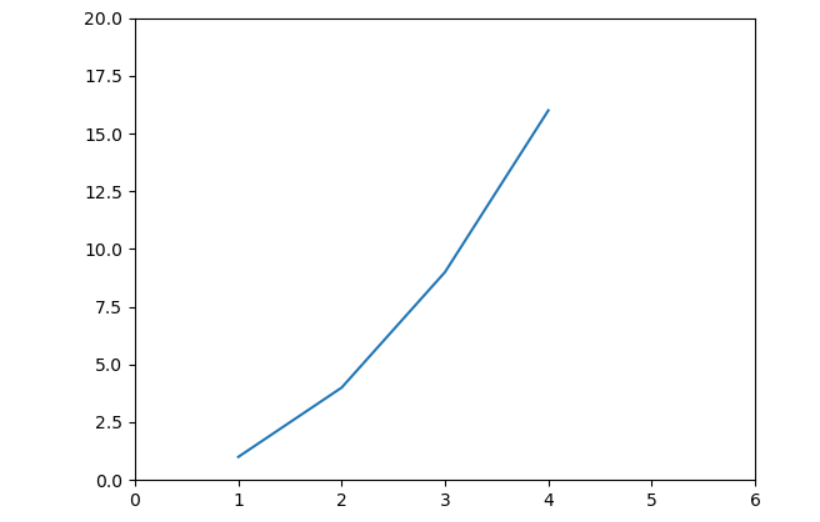
We will import the matplotlib library and then plot some example data points. The plot function marks the x-coordinates(1, 2, 3, 4) and y-coordinates(1, 4, 9, 16) in a linear graph with specified scales.
Python program to show plot function
# Python program to show plot functionimportmatplotlib.pyplot as pltplt.plot([1, 2, 3, 4], [1, 4, 9, 16])plt.axis([0, 6, 0, 20])plt.show() |
Output
Matplotlib Pyplot Examples
There are various ways to create Matplotlib Pyplot. here we are discussing some generally used methods for creating Matplotlib Pyplot those are following.
- Linear Plot using matplotlib.pyplot
- Linear Plot with Line Formatting
- Scatter Plot with Color Mapping
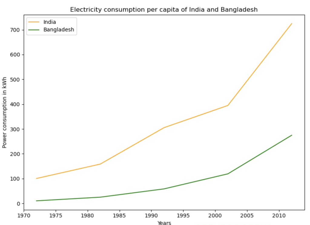
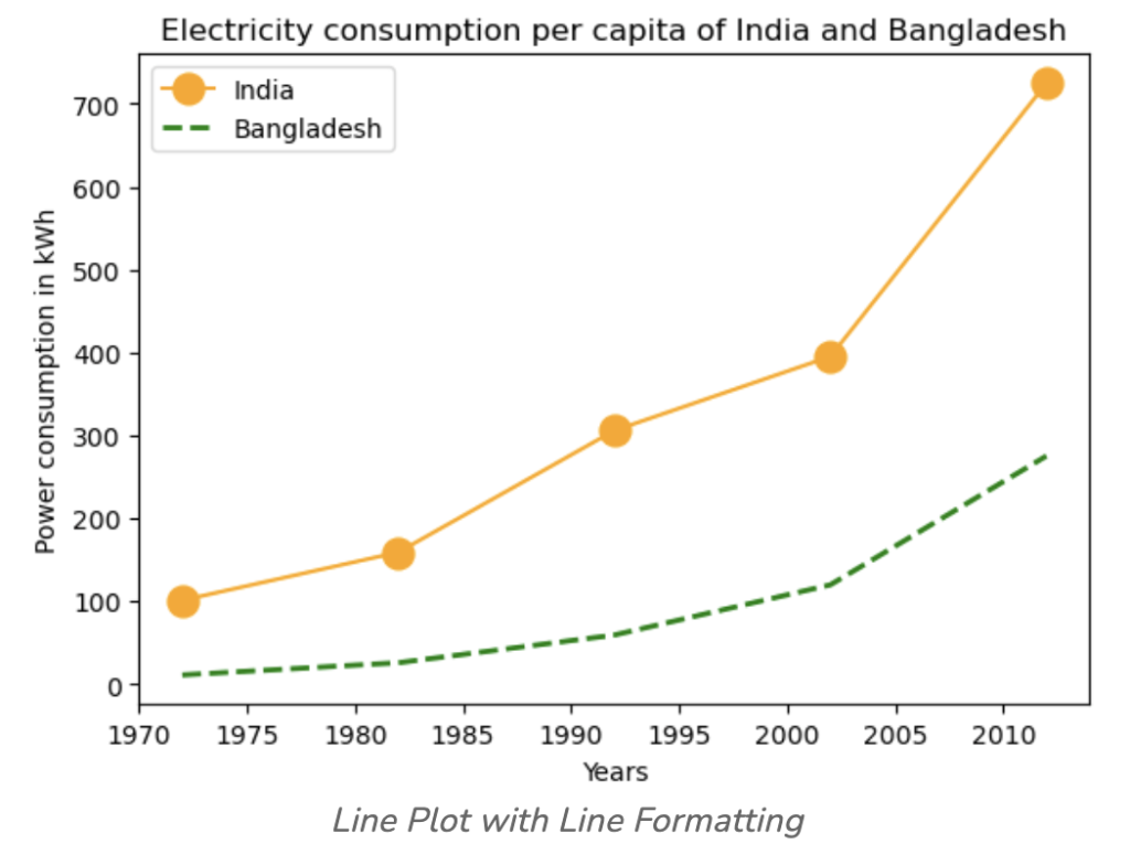
For example, we will use India and Bangladesh’s electricity power consumption datasets. Here, we are using Google Public Data as a data source.
We will plot power consumption in kWh by India and Bangladesh with years as the X-axis.
Linear Plot using matplotlib.pyplot
In this example code uses Matplotlib to plot the per capita electricity consumption of India and Bangladesh from 1972 to 2012. Two lines represent the countries, with different colors. The plot includes axis labels, a title, and a legend for clarity.
# Python Program to illustrate Linear Plotting |
Output :
Linear Plot with Line Formatting
In this example we will plot the same plot but with a variation in the lines plotted. We can use dashed line or a line with markers.
- Python3
# Python Program to illustrate Linear Plotting |
Output:
Scatter Plot with Color Mapping
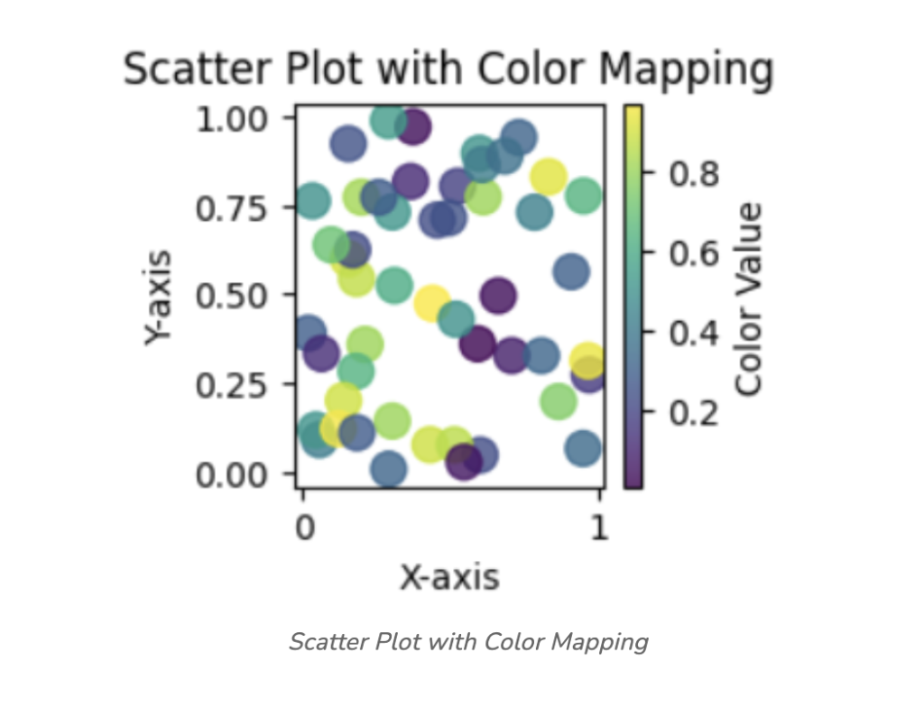
In this example, Python code uses Matplotlib and NumPy to generate a scatter plot with random data. The `x` and `y` arrays represent the coordinates, and the `colors` array provides color values. The plot includes a color mapping using the ‘viridis’ colormap, a color bar for reference, and axis labels. Finally, the plot is displayed using `plt.show()`.
- Python3
import matplotlib.pyplot as plt |
Output:
Looking to dive into the world of programming or sharpen your Python skills? Our Master Python: Complete Beginner to Advanced ٍResources is your ultimate guide to becoming proficient in Python. This Resource covers everything you need to build a solid foundation from fundamental programming concepts to advanced techniques. With hands-on projects, real-world examples, and expert guidance, you’ll gain the confidence to tackle complex coding challenges. Whether you’re starting from scratch or aiming to enhance your skills, this course is the perfect fit. Enroll now and master Python, the language of the future!


